The Click
Categories
Photographers
The Click on Bluesky
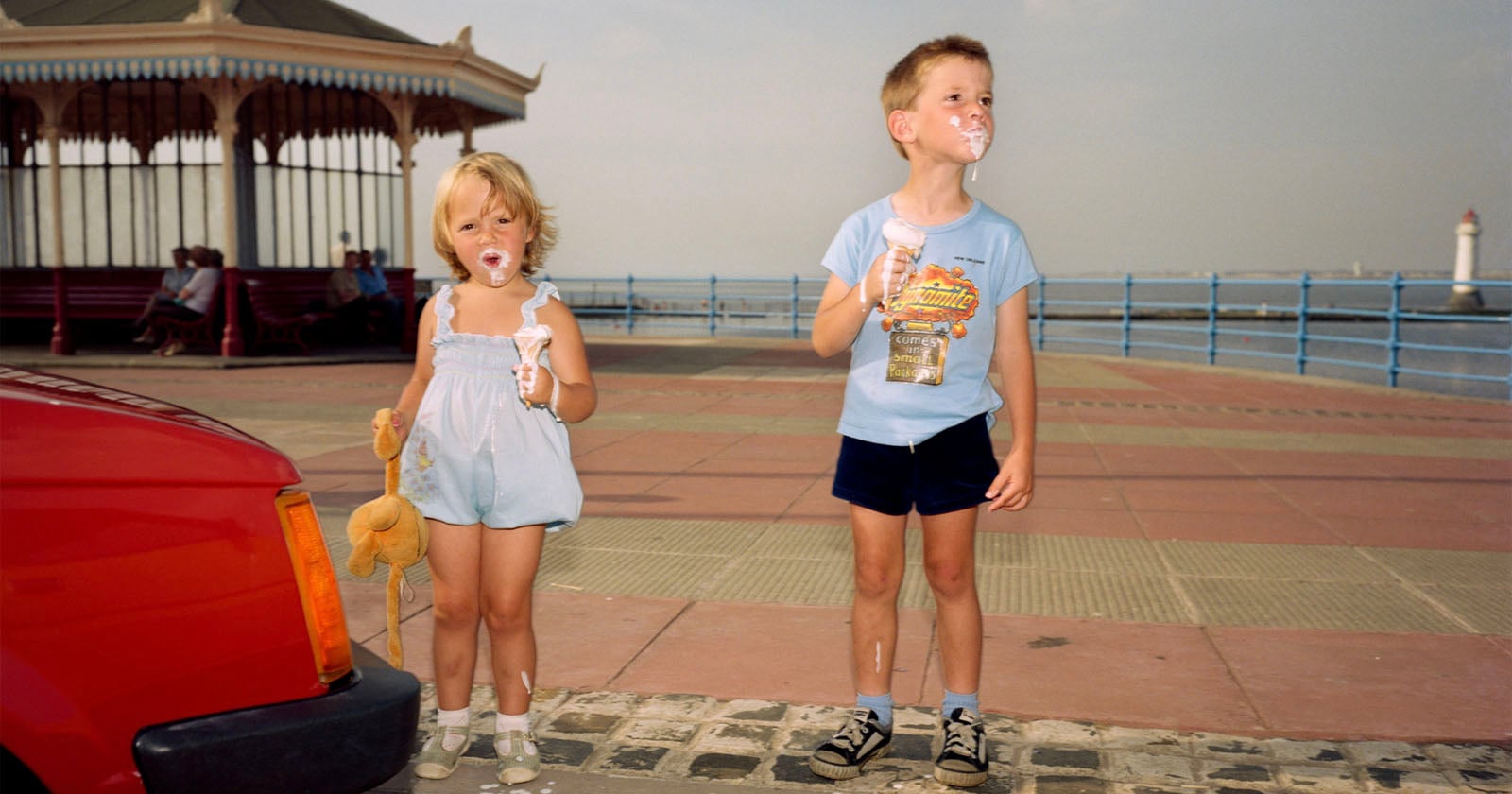
Martin Parr: The Photographer Who Inspired Me To Pick Up a Camera
Martin Stranka: All My Strangers
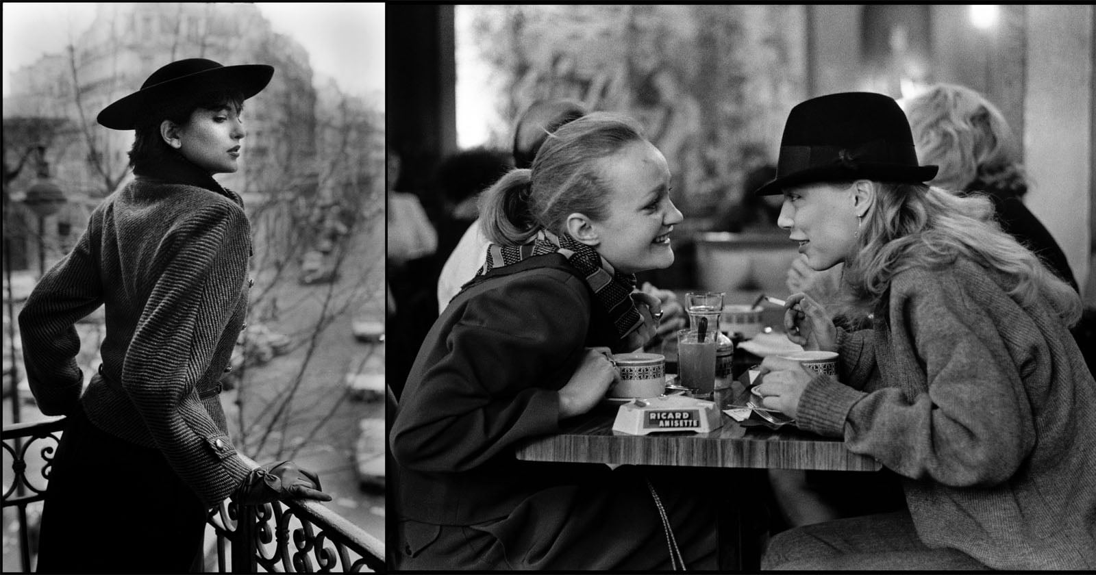
Photographer's 50 Year Love Letter to Paris
Teen Rebellion Immortalized, Through the Eyes of Chris Steele-Perkins
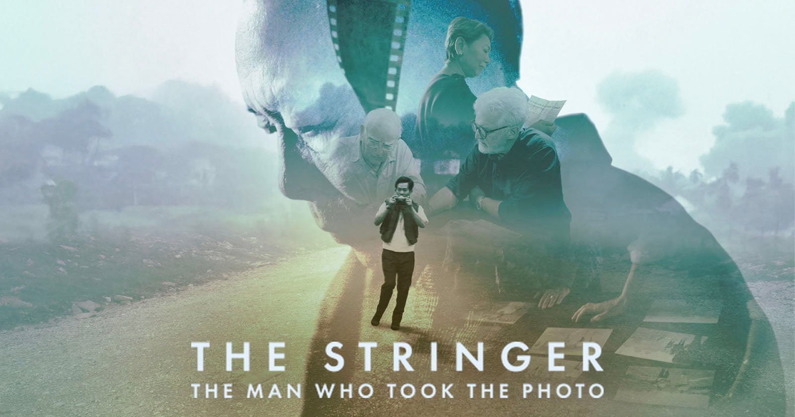
Dave Burnett Says 'The Stringer' Used His Photos Without Permission or Attribution
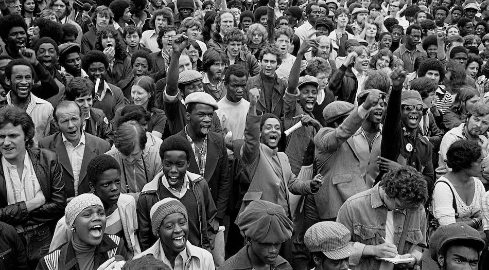
Framed and defanged: Steve McQueen’s Resistance